Developing a Barometer-driven tool to support action on Data Values

This is the third post in a series produced as part of the analysis for the Measuring Data Values Around the World project.
One of the ways we have been exploring how far the Global Data Barometer might be used to support work on the Data Values agenda (which advances a focus on inclusive and participatory data governance), is to go through some rapid prototyping of a ‘product’. In our proposal, we had initially suggested this might be an index or benchmark of countries against the Data Values framework, but we quickly discounted this idea on the basis both that currently available data from GDB only partially maps to the data values framework, and, more importantly, that the driving use cases for linking the GDB and Data Values framework are less about ranking countries, and much more about providing support for engagement and advocacy.
So, after early experiments and sketches, we settled on the model of a dashboard, oriented towards users who want to get an at-a-glance view of the challenges, and hopefully opportunities, to advance data values in a particular country.
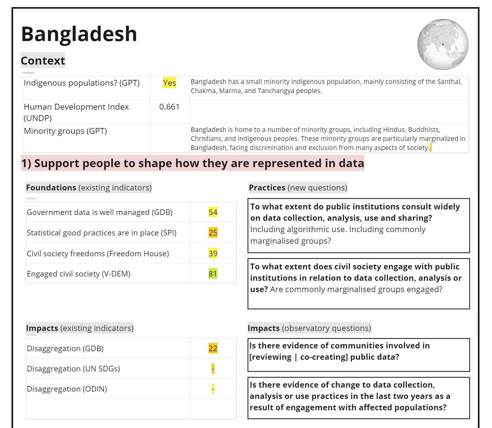 Image 1: Early mock-up of a dashboard.
I had initially planned to build out a Jupyter notebook or Plotly Dash tool, but quickly found the overhead of the code, and of deciding on detailed dashboard layout, was getting in the way of a focus on mapping concepts and fields, so have settled on a lower-fidelity prototype using a Google Spreadsheet, a lot of =QUERY() formulae, and a Jupyter notebook feeding filtered and melted data into source sheets.
To develop this prototype we had to think about the kinds of data that the Barometer and secondary sources currently provide, and the kinds of data that could be provided in future. After a few iterations we’ve settled for now on:
Foundations - Barometer metrics are well suited to showing if a country has reasonable foundations for action on data values.
For example, to support people to shape how they are represented in data, it is reasonable to assume that it helps for a country to have good data management practices already in place. This is something the Barometer can report on.
Context - Currently there are a number of Barometer datapoints that might be used to provide contextual information for engagement on data values in particular sectors (e.g. describing the current arrangements around climate vulnerability or land data) although these are hard to capture in a general dashboard.
The are other contextual factors that are useful to thinking about the primary data value challenges a country might face, such as understanding the particular communities who may need access to decision shaping and making power around data.
As the public Barometer dataset does not provide this more general contextual information, we have experimented in the prototype with the use of ChatGPT to generate text (you can read more on that experiment here).
Outcomes - The Barometer (and other sources) can provide a number of proxy metrics for the expression of data values in a countries data system - in particular by looking for levels of data disaggregation and intersectionality, but also by drawing on individual Barometer data points around whether certain key datasets have missing data or not.
The prototype draws on both aggregate quantitative, and individual question qualitative data to provide insight on outcomes.
Observatory - There are a number of questions that might be asked about how far the data values framework is being advanced in a given country that may be more difficult to turn into metrics, but that are useful to have evidence against.
We’ve put these under an observatory category, and in a separate post will outline some considerations on which of these themes might be addressed through new primary questions in future editions of the Barometer.
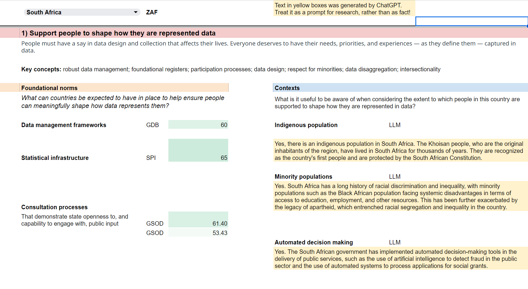 Image 2: Early version of Google sheets prototype
Testing the prototype
Having fully populated a prototype spreadsheet, we invited members of the GPSDD and Connected by Data teams to make a copy of this sheet, explore how it might be used, and provide us with comments through a feedback form.
Comments pointed to the potential of a tool like this to inform country engagement, support identification of good practices, and showcase progress on data values. At the same time, they noted the challenges of drawing comparisons based on quantitative scores without greater detail on the methodology, and noted the different levels of detail in justifications and supporting information given for different countries.
A number of comments noted the limitations of the Google Sheets interface, but as one comment noted: “I think there is huge potential here! I’d love to eventually see a very user-friendly visual interface with different ways of presenting this data.”
Where next?
Because of some of the data limitations, and usability issues identified during testing the prototype, we’re not releasing it in full, but it has helped us to explore in more depth both how GDB data maps onto the Data Values framework, and how indicators and evidence from the GDB might be used in practice.
If future editions of the GDB gain greater coverage of Data Values themes, then we think there is potential for a future data values dashboard based on GDB data, focussing particular on qualitative insights and contextual information, using comparisons to support exploration and discovery of bright spots and good practice, rather than to rank or directly compare countries.